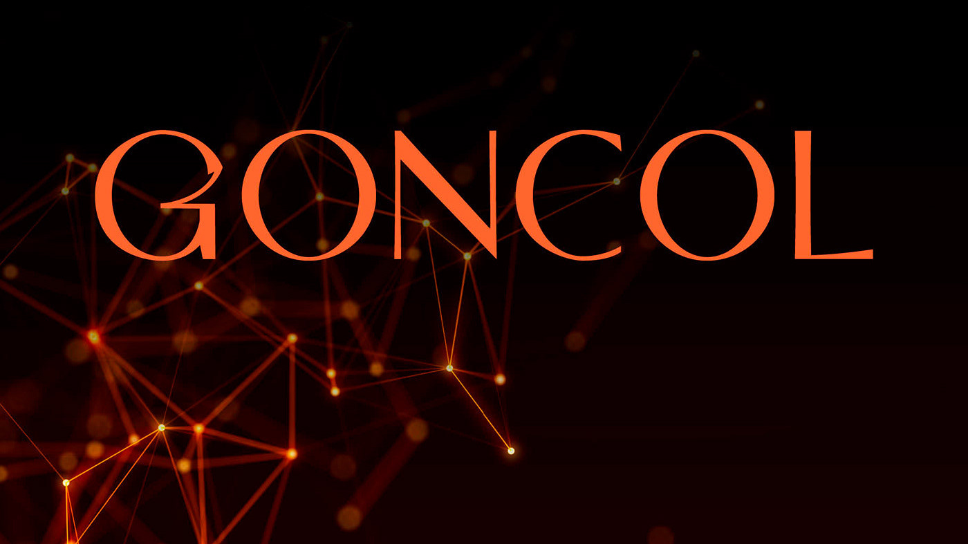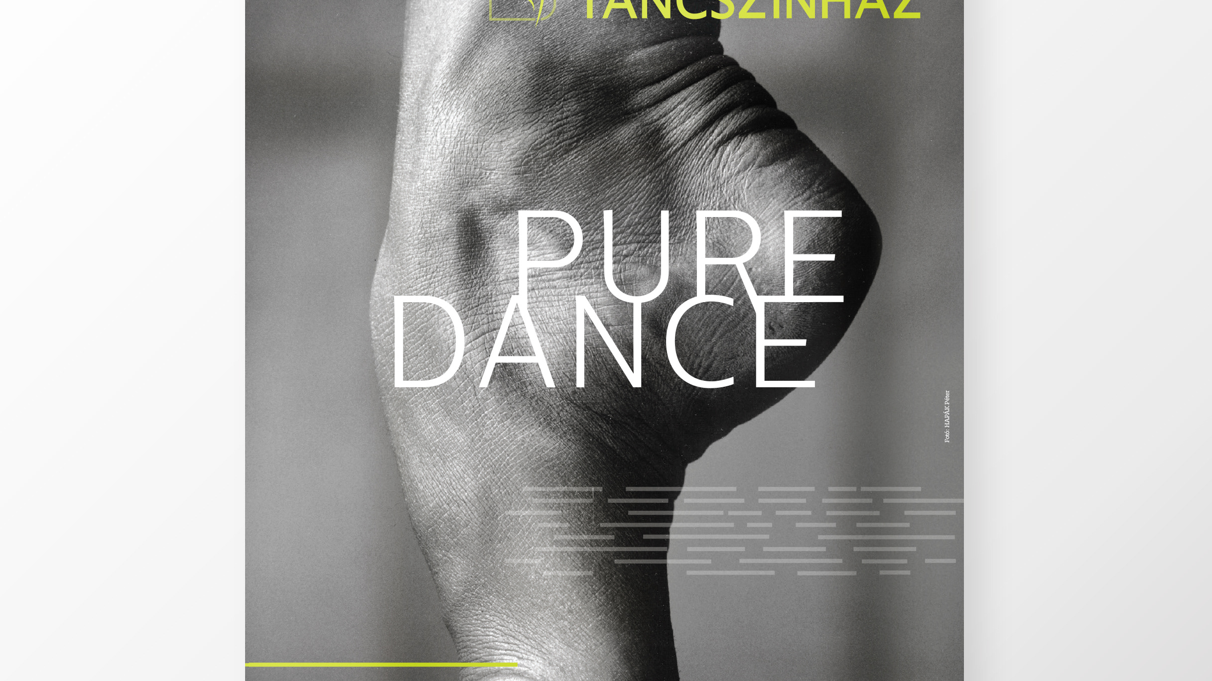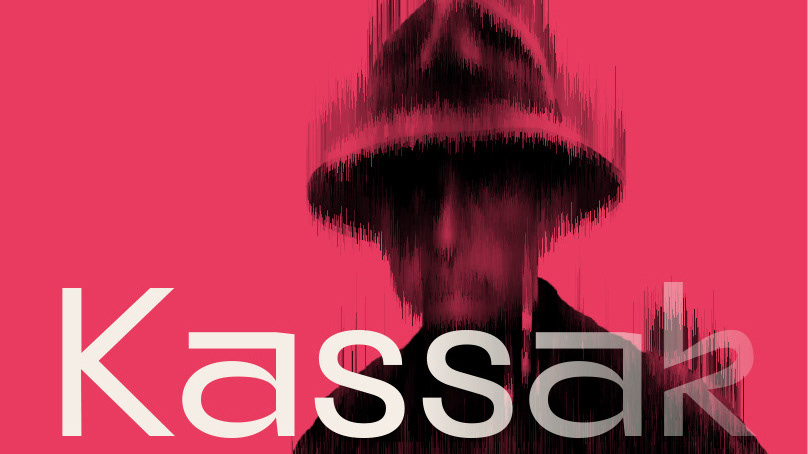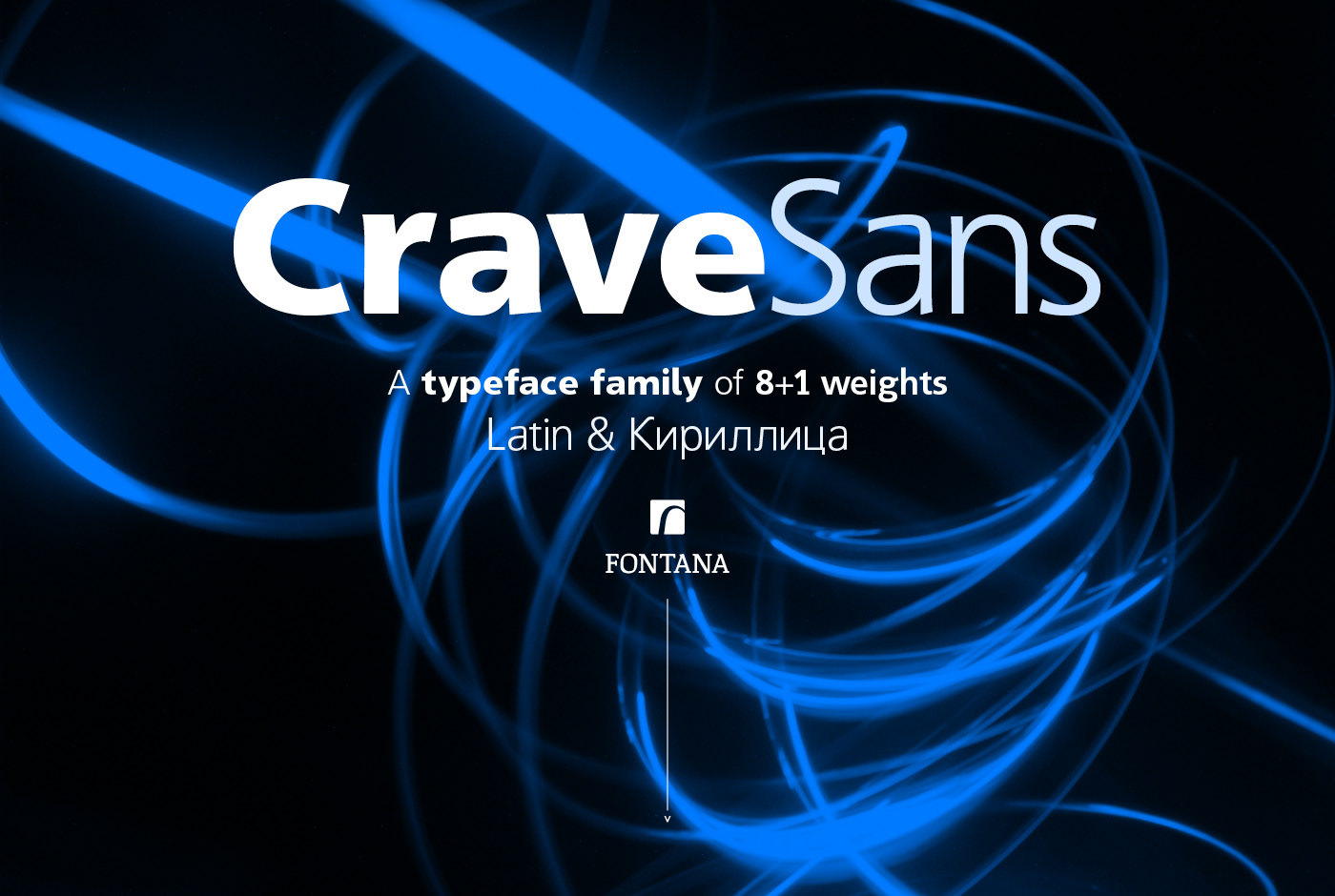
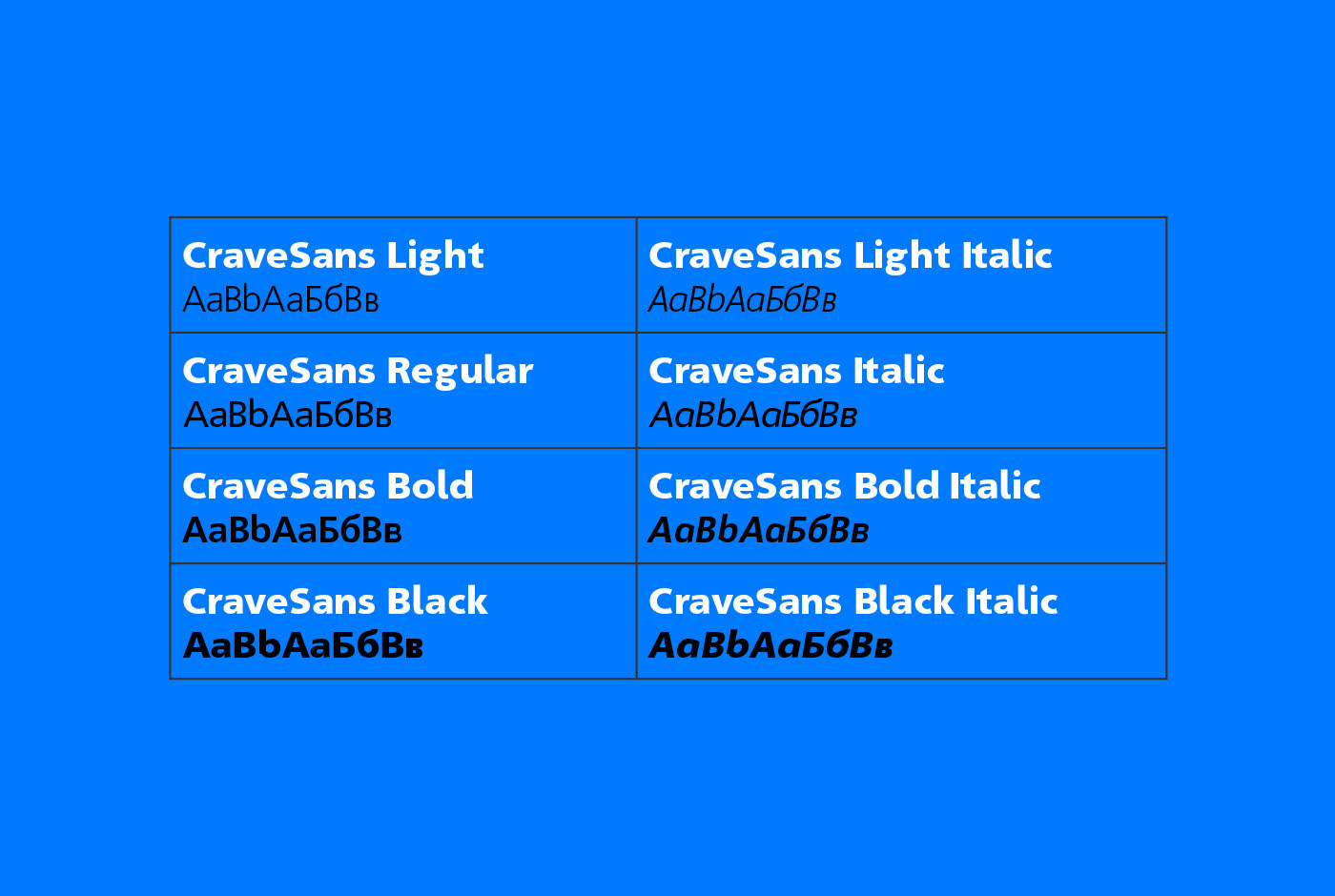
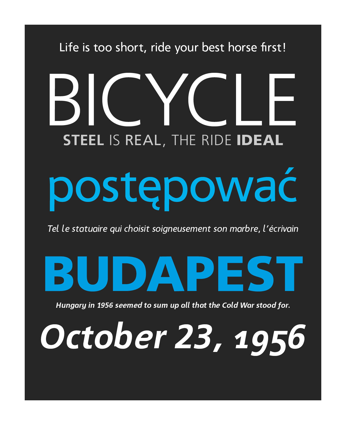
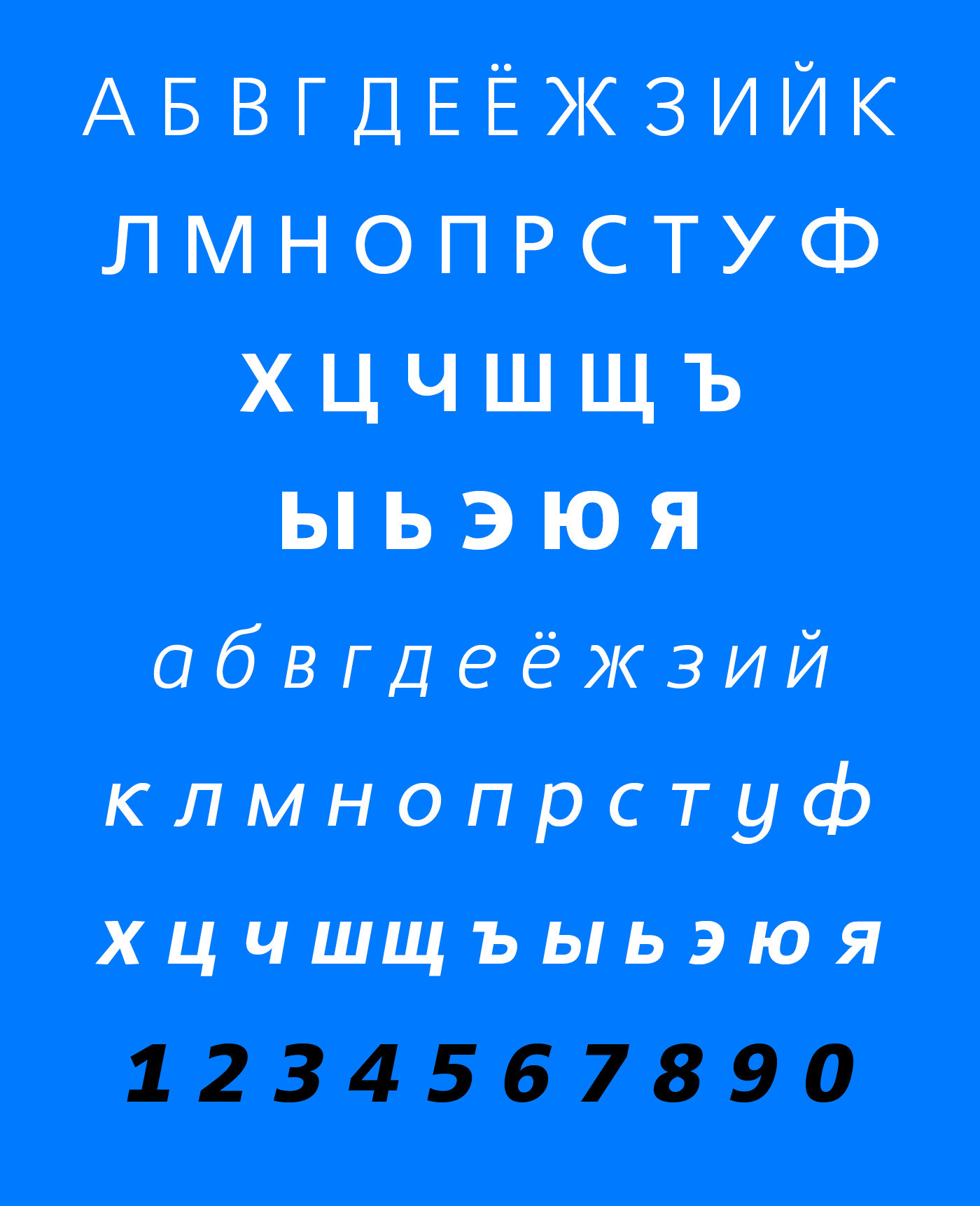
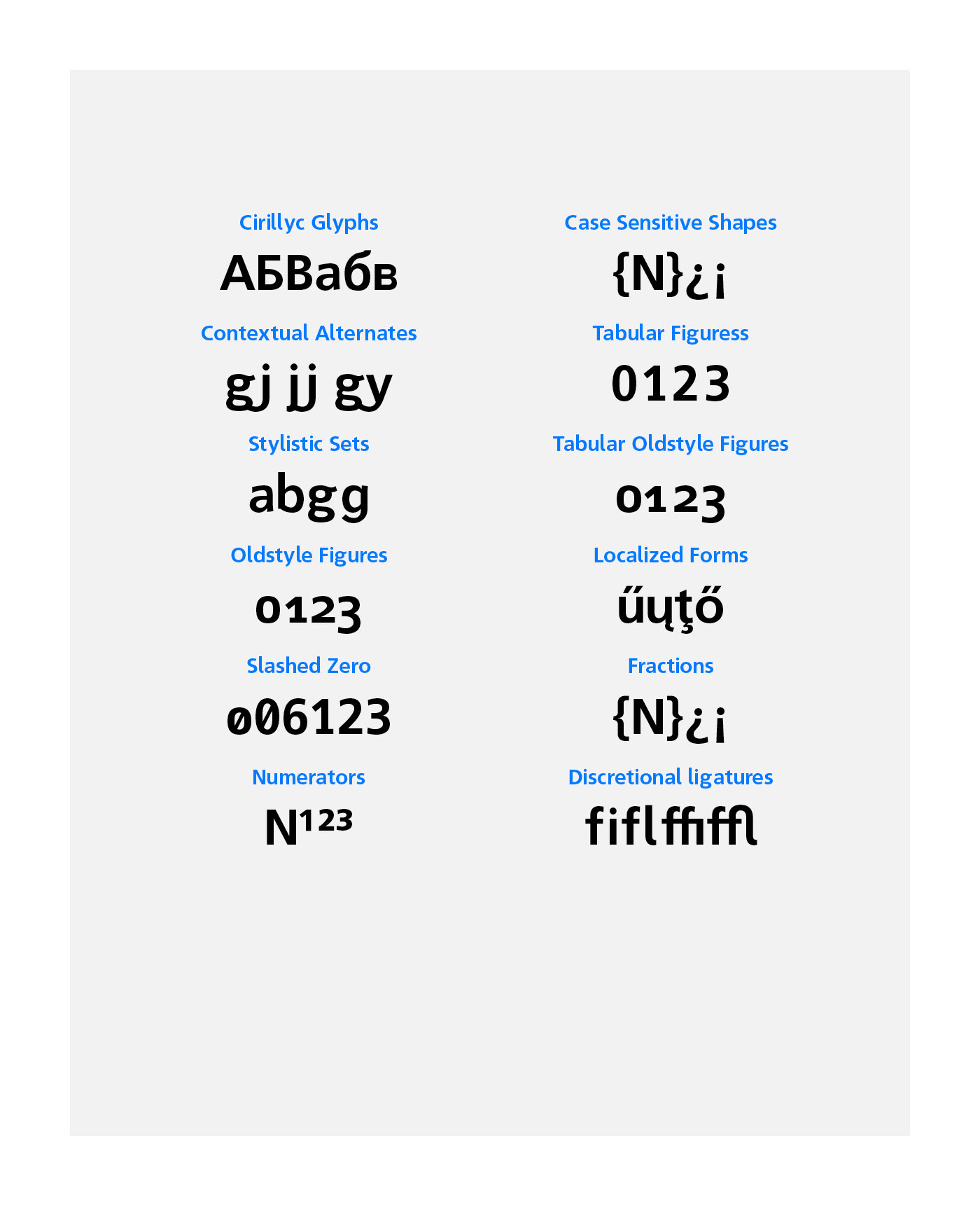
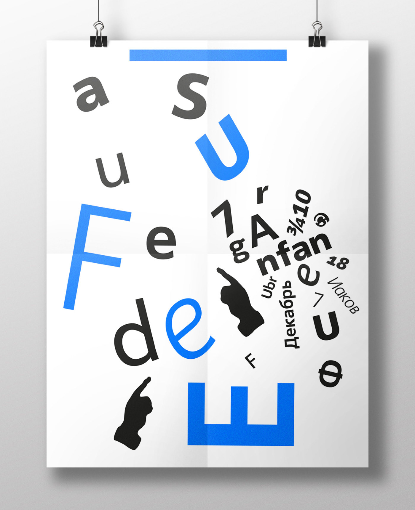
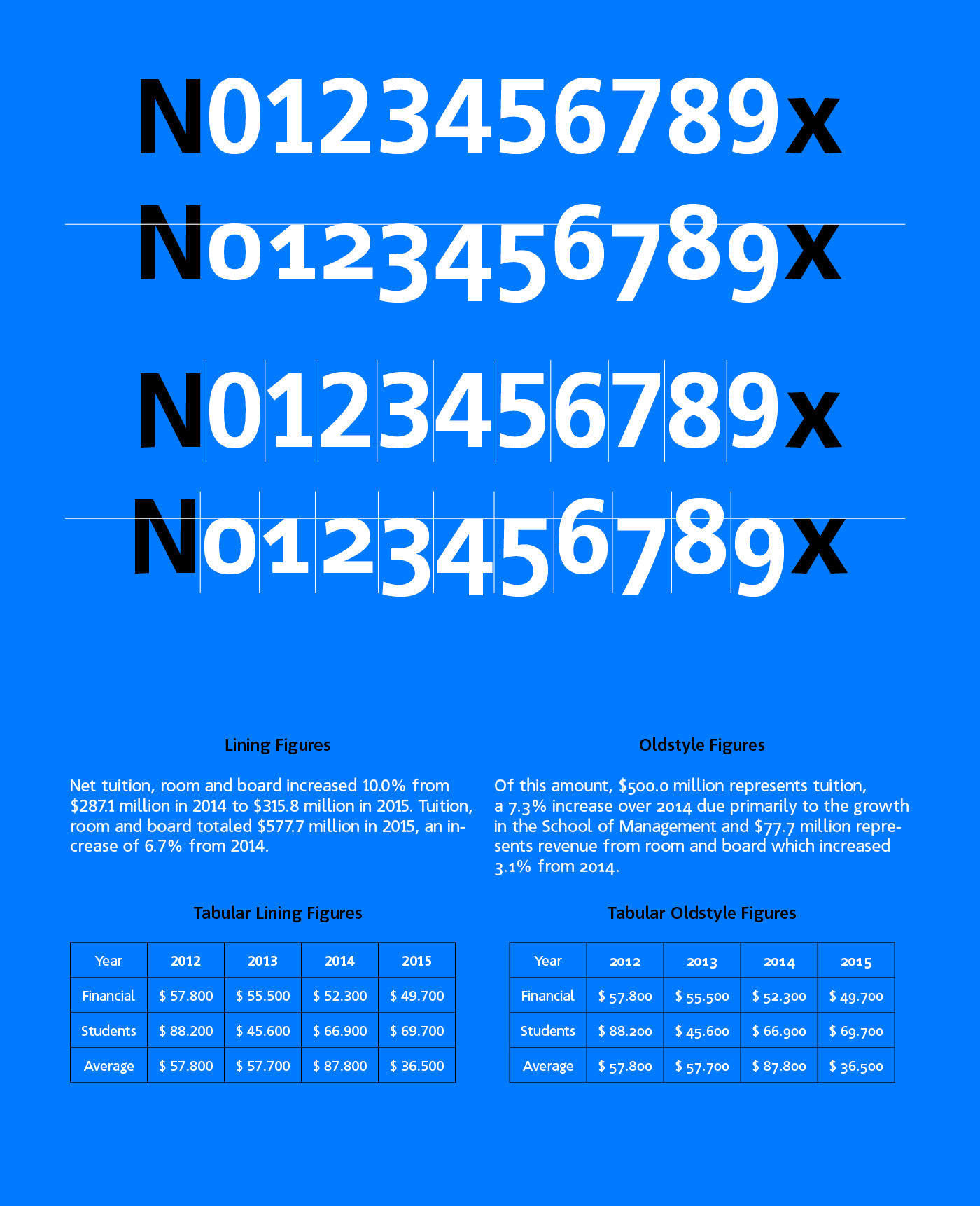
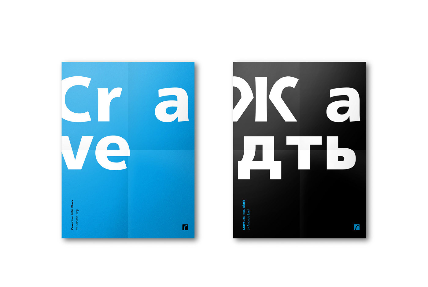
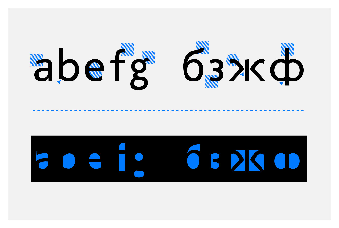
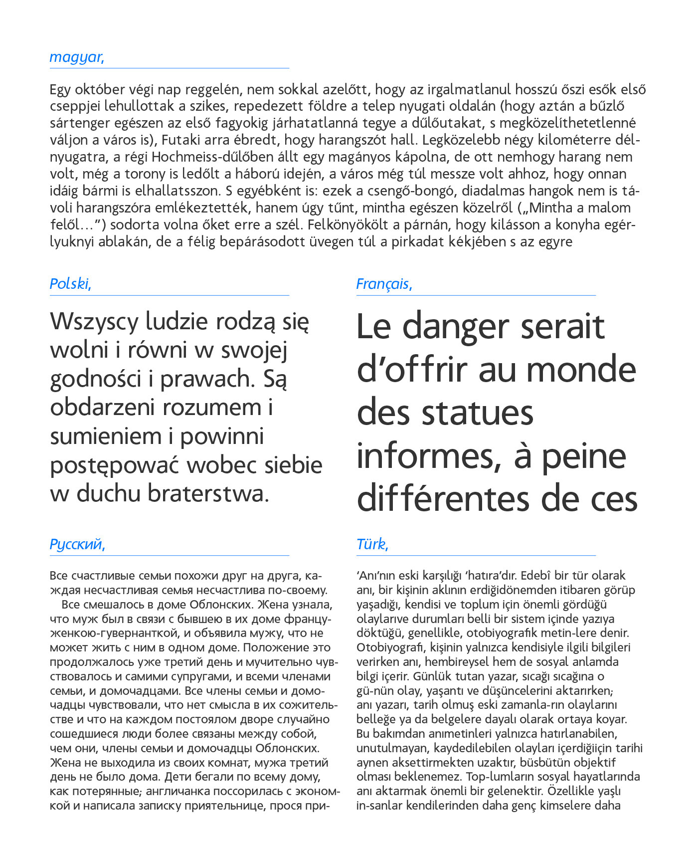
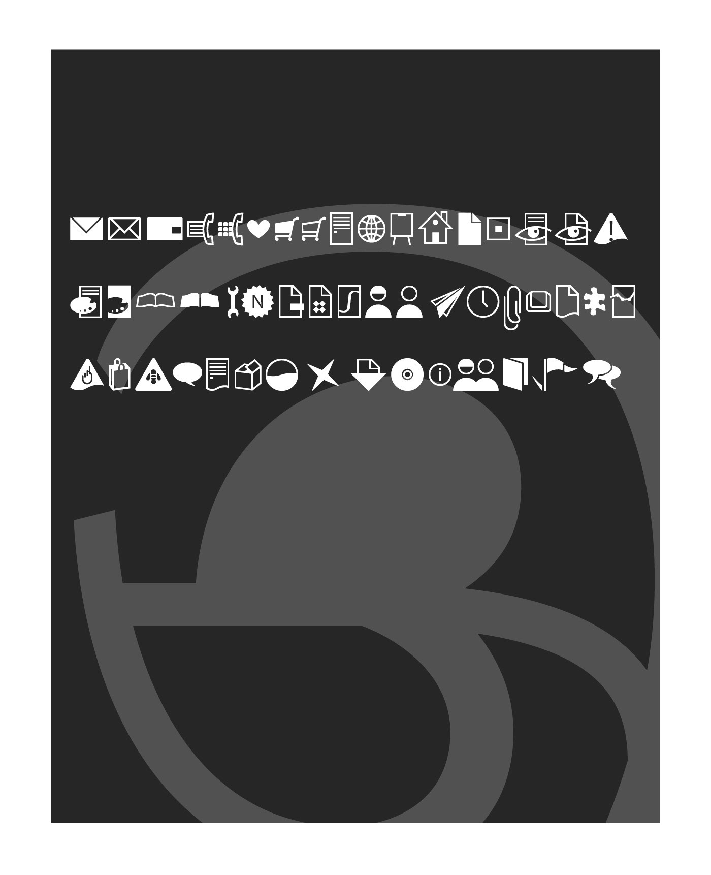
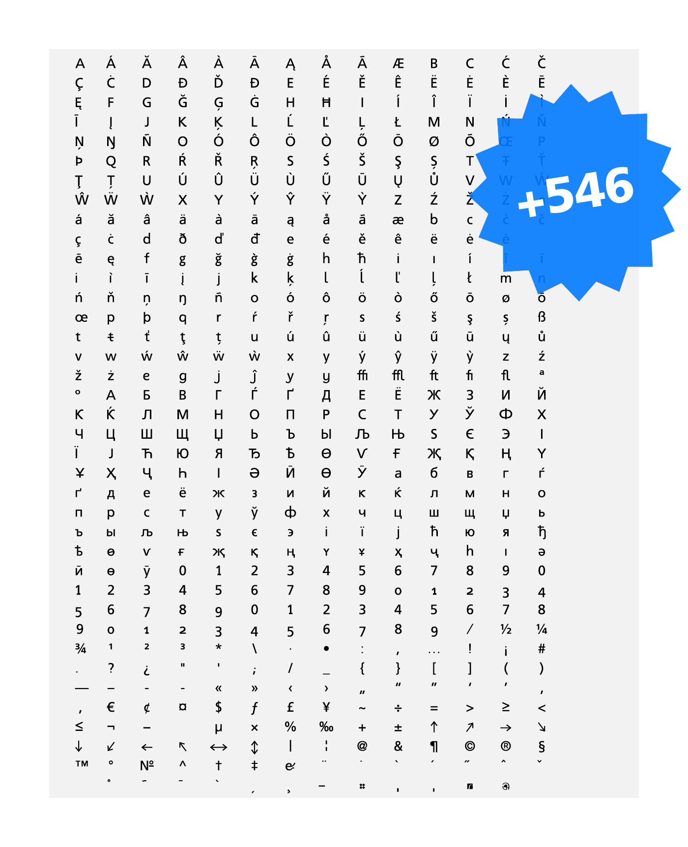
CraveSans is a font family made to fit the recquirements of the era. It is highly legible; besides, it is transparent enough not to be intrusive on any surface. With its 8 versions it gives enough freedom for every field of usage. Despite its “grotesque” feature, it has some unique characteristics borrowed from handwriting for instance the lower case ‘k’ ‘l’ or the upper case ‘K’ letters. Many typefaces have their alternative versions, e.g. in the regular versions of the font ‘y’ and ‘g’ or in italics the version of the font ‘r’. CraveSans can be well-applied in a wide variety of layouts including mobile apps, magazines, newspapers and books. Its history dates back to approximately 2008 when the first versions were made for the Hungarian Airlines, Malév. This year it has been totally renewed with some designed Cyrillic characters and the updated fonts of the Latin alphabet. The first version didn’t even contain italics, but have since been added. Special characters have been added as well; moreover, every weight has been given tabulated and oldstyle numbers, too. Dingbats, which is a collection of special pictograms, has also joined the font family.
The typeface family supports all the European languages except for Greek. It is available on every platform in both Opentype and WebFont format.
As for future plans, the formation of SmallCaps is also planned as well as some additional ligatures and Opentype features into the font.

"CraveSans can be well-applied in a wide variety of layouts including mobile apps
It is available on every platform in Opentype and WebFont."
It is available on every platform in Opentype and WebFont."
Introductory offer available for a limited time only
on CreativeMarket
on CreativeMarket