One of the most beloved letters of the 1920s was reborn in Glosso. Imre Kner also pays a tribute to it in his 1933 study: “Known as the Roman or Romanian antiqua, the medieval typeface got into the type caster again as a compromise of written character and letter-cutting. Out of this round letter came those closed type families as huge blocks out of which the cover of the era has been built.”
The modern history of the letter started on the turning of the millennium. The type families were made in the workshop of Fontana for the Eastern European version of the OpenOffice™ that recently got into the Sun Microsystems’ Portfolio. The design of Glosso (which curiosity and beauty lies in its tiny foot) with its baroque features started the same way. However, before the type family could have gained it's final form, the Sun Microsystems unfortunately got out of the project reneging on the oral agreement. The work done so far however was not in vain; after the Fontana Type Foundry, first the T-26 Digital Type Library started marketing the letter type around the world.
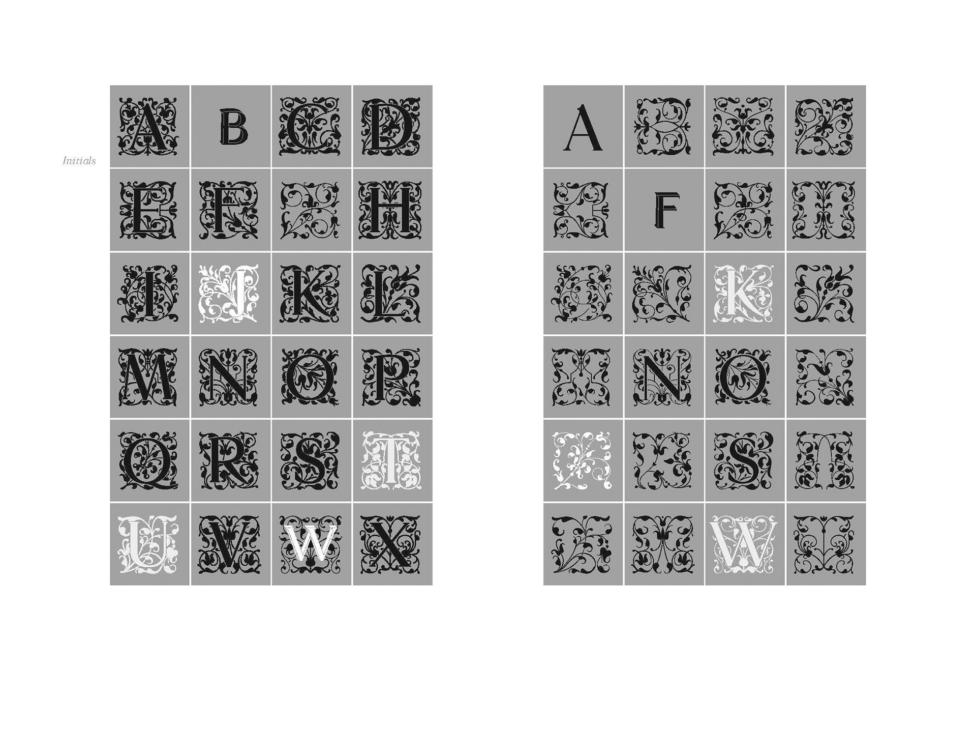
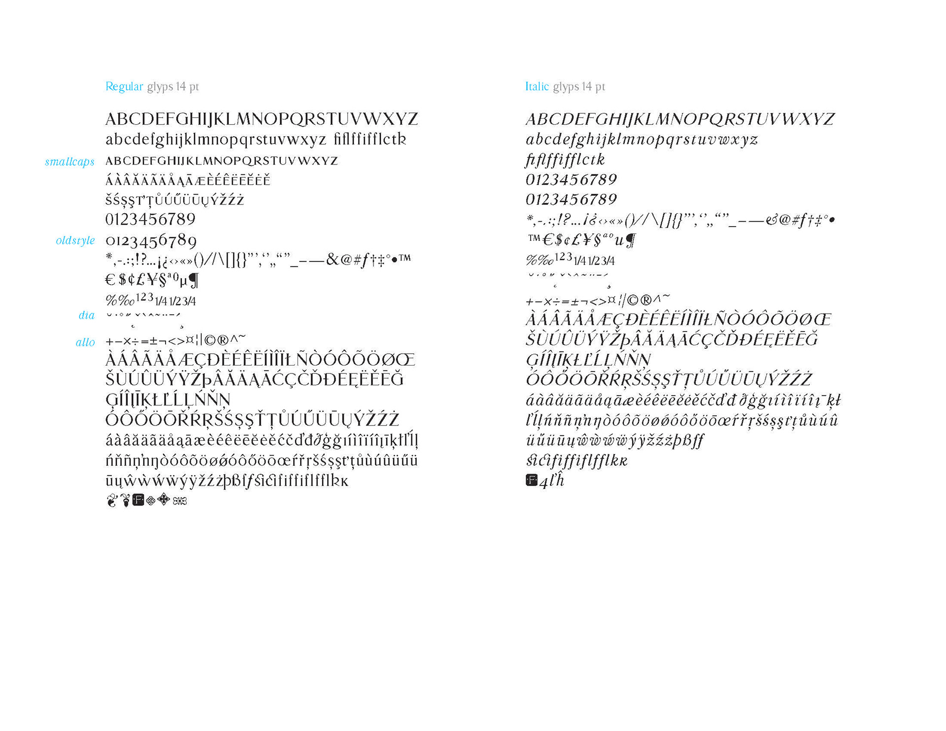
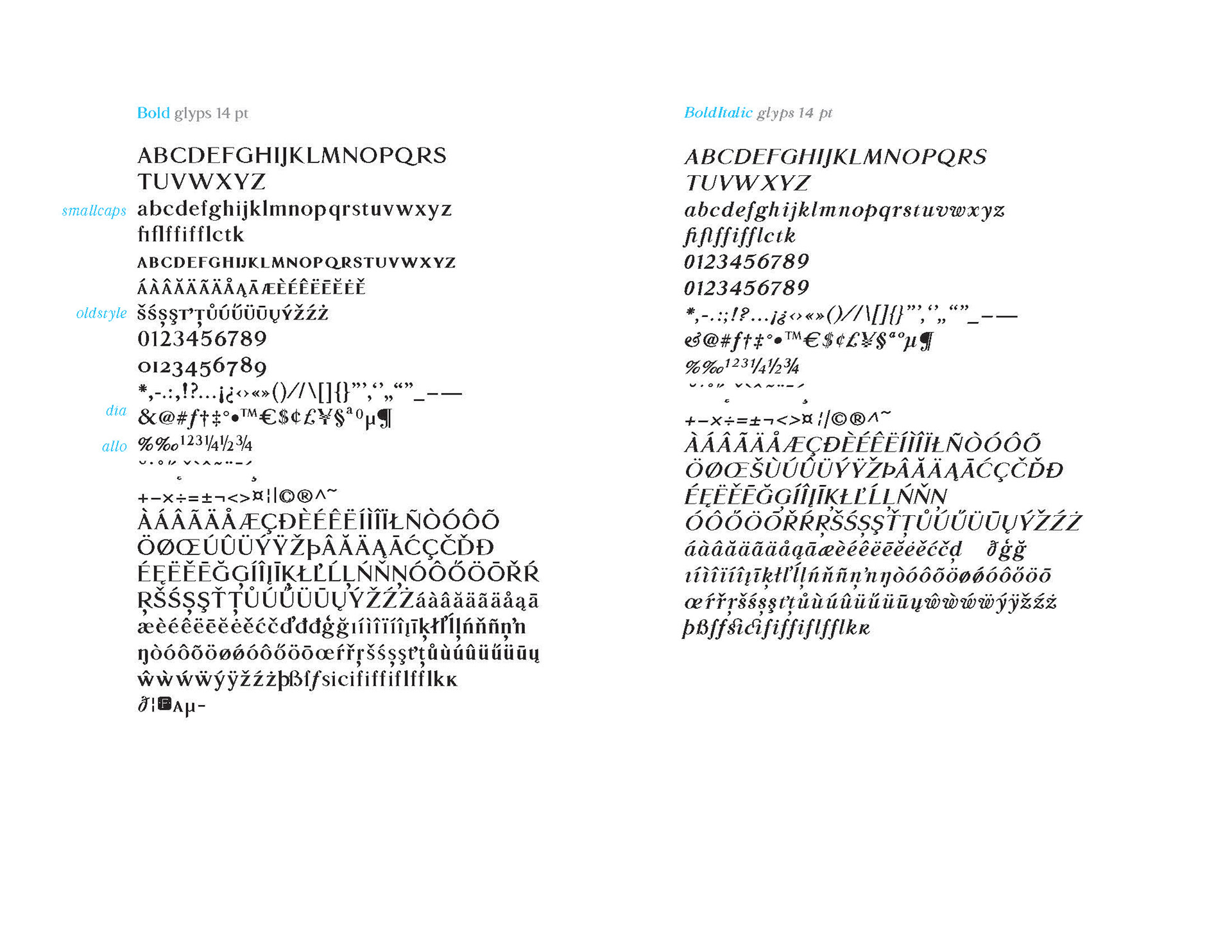
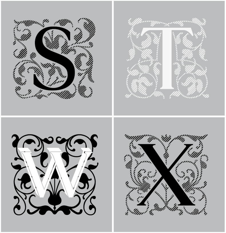
It is true that the letter has been in circulation for nearly 10 years, it will really amaze its users in a new, embellished form. Finally, this extremely utile text letter can really show its true colours. Several functions have been added to its usage making it even more easily to use. Among other things, the total support of the Latin-based languages (Western-, Central-, Eastern European, Baltic and Turkish) is included. The basic form has been completed with small caps, however we don’t have to give up on old style numbers either. The beautifully drawn ornamental initials are also captivating.
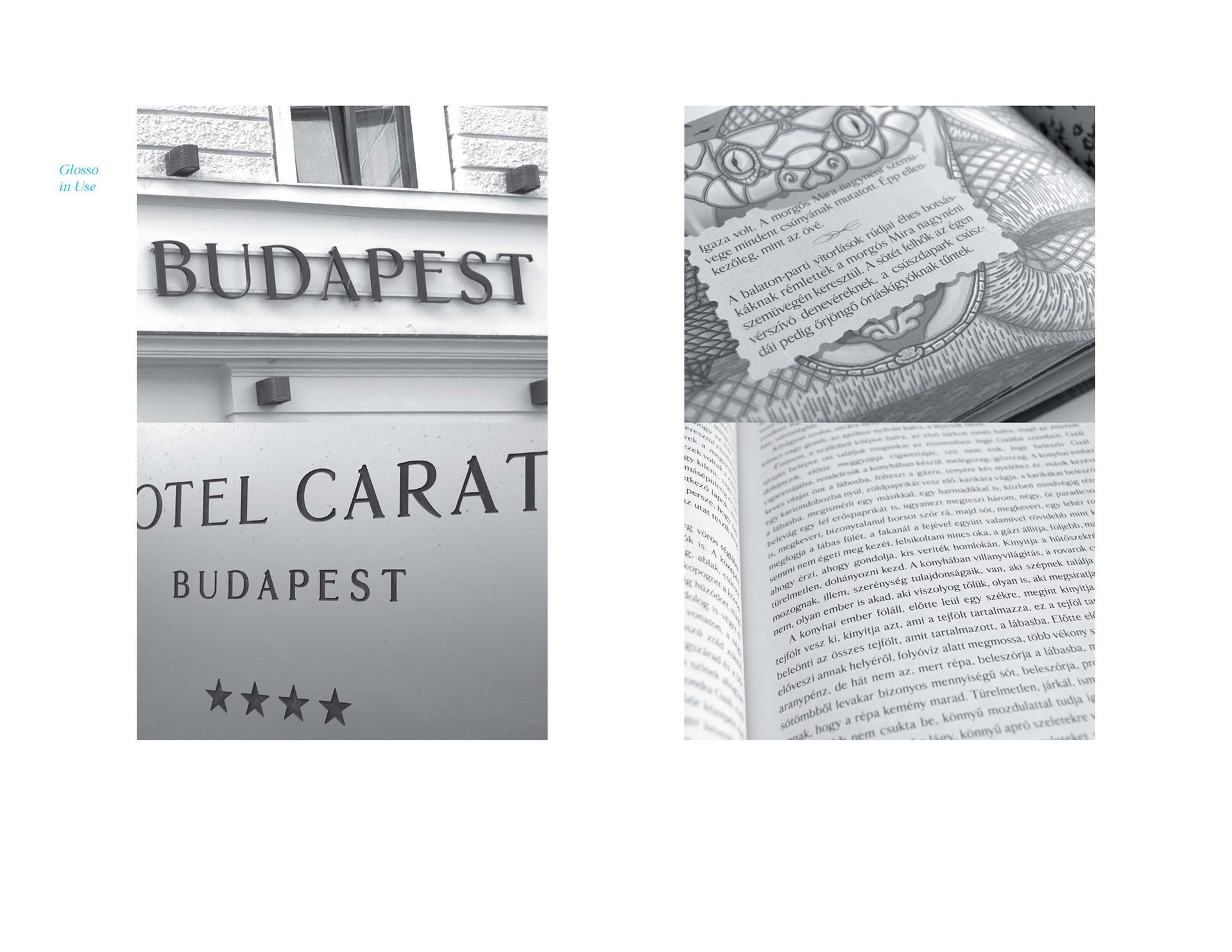
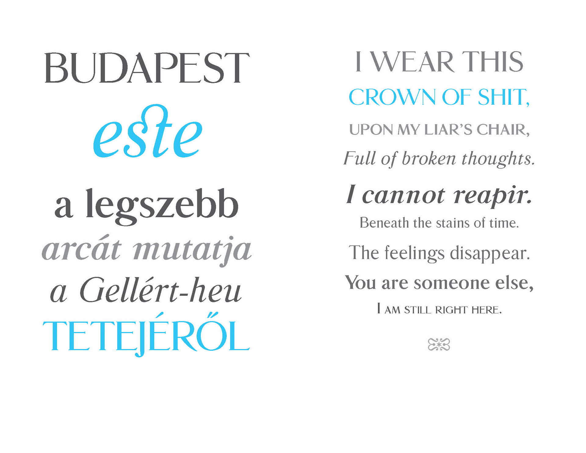
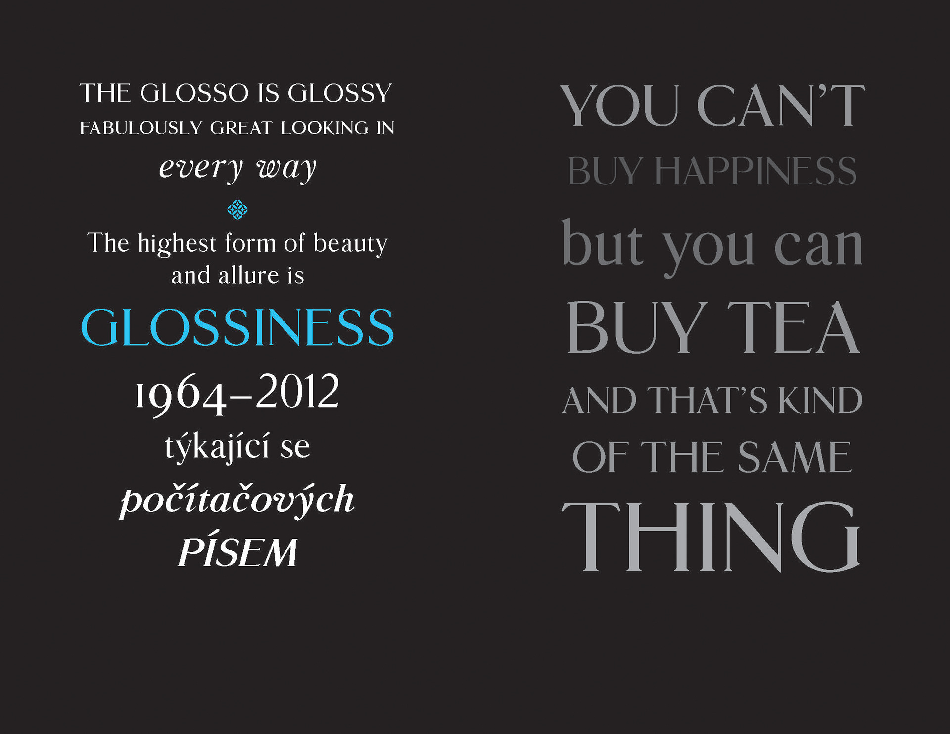
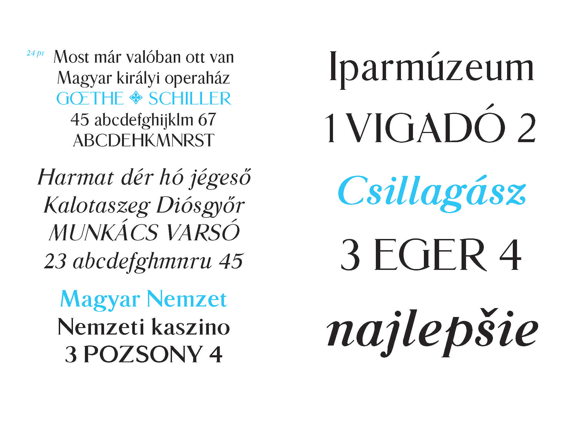
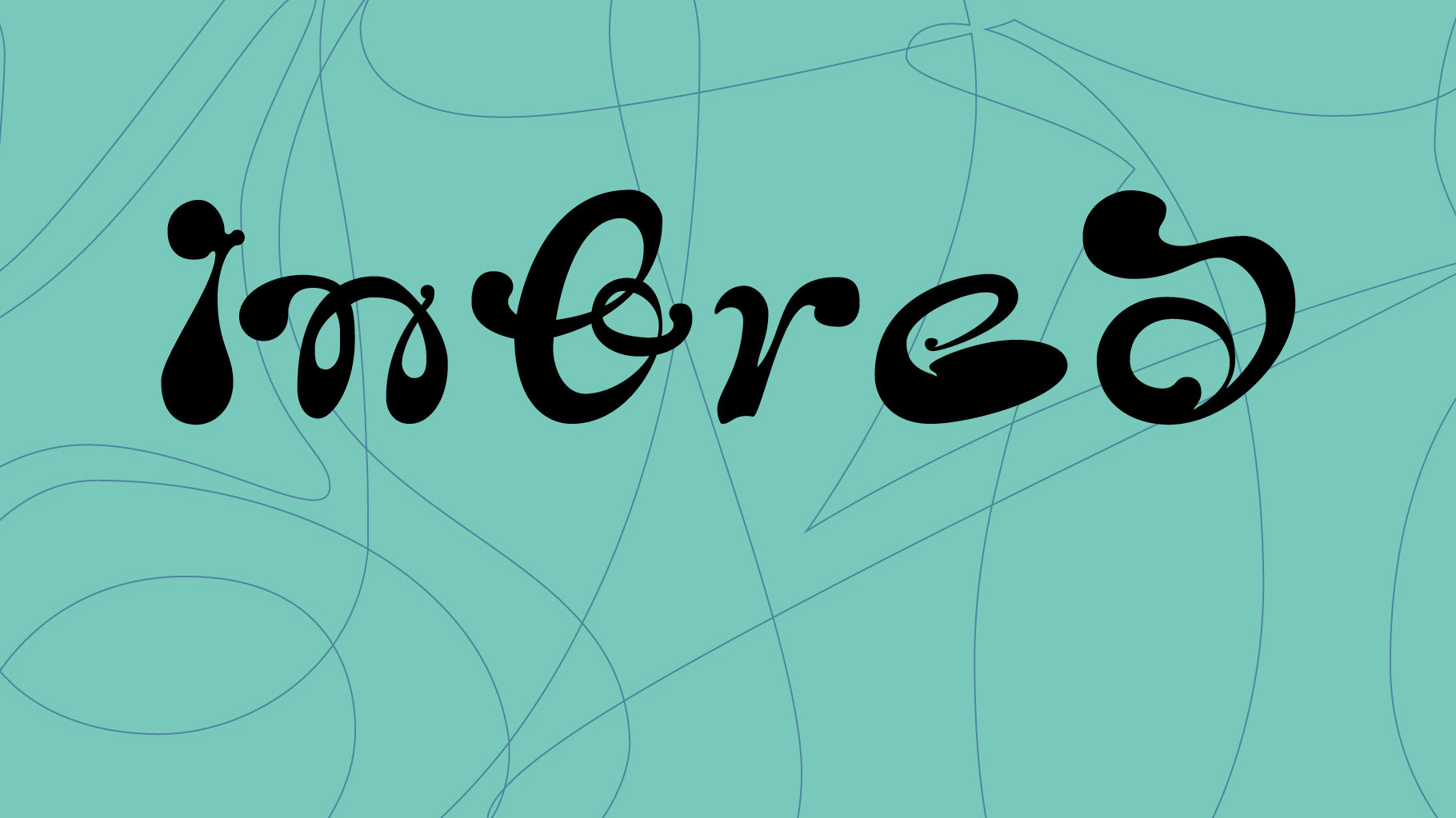
Glosso Novum in use.